

2024
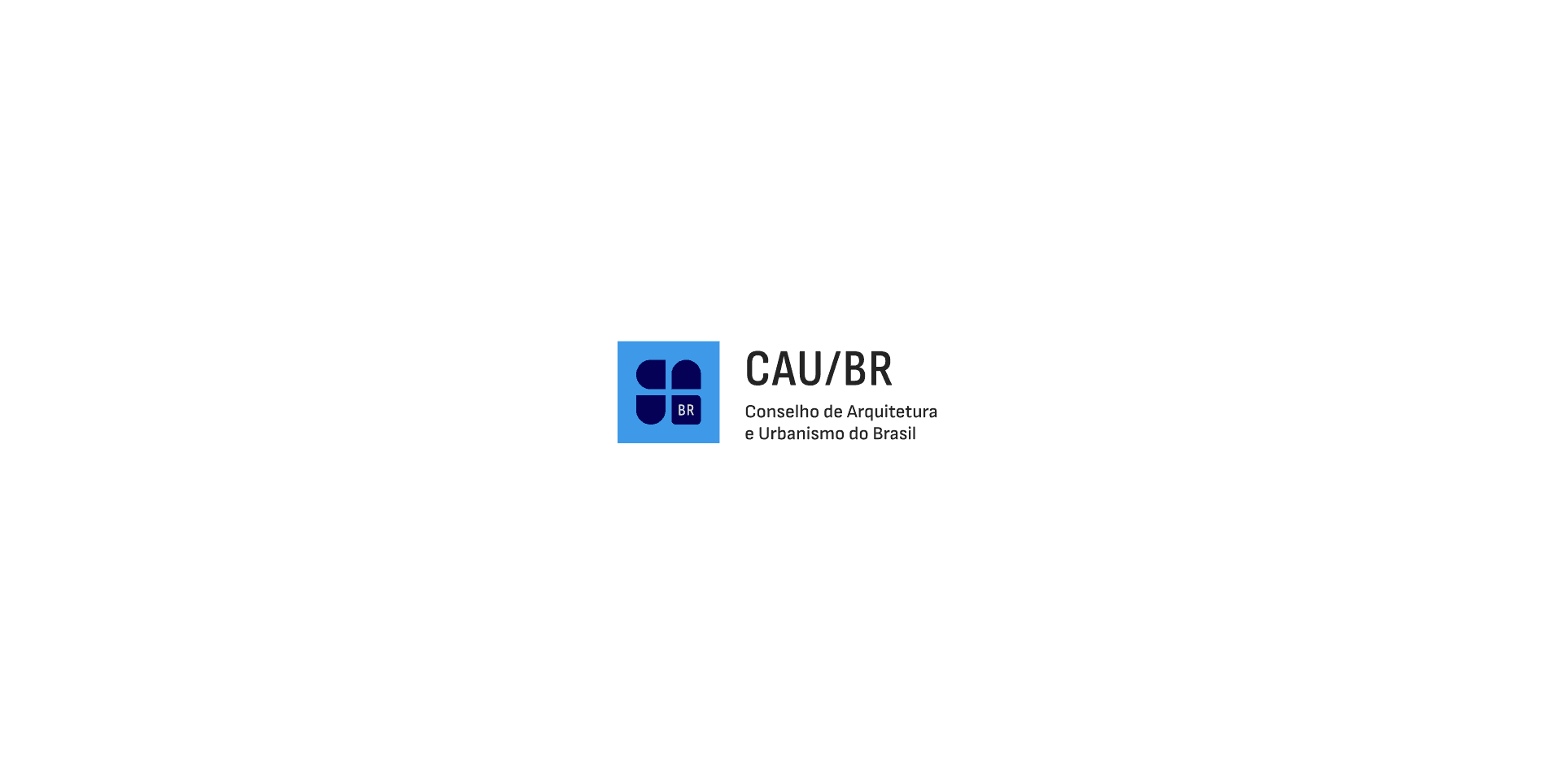
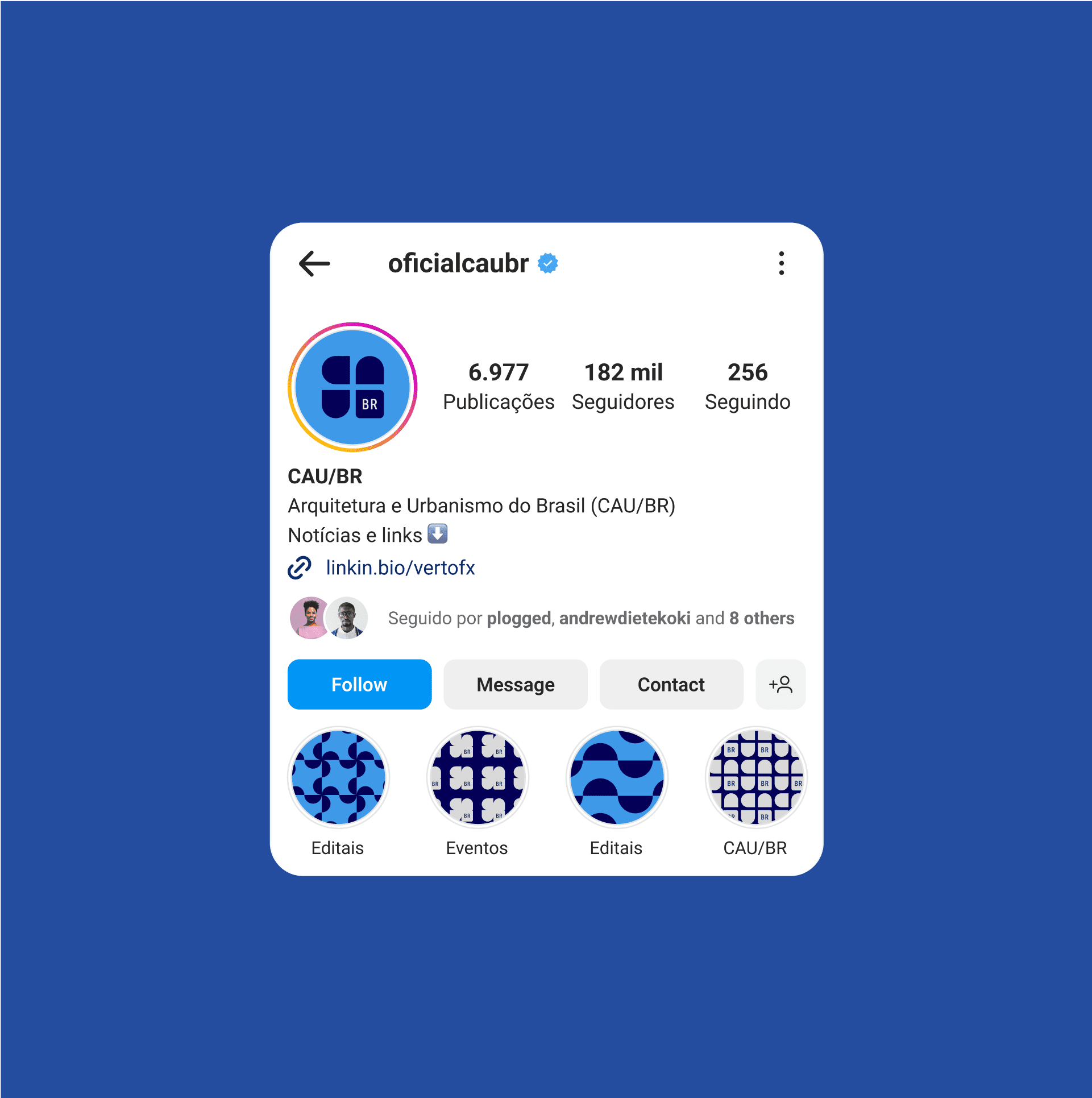
CAU / BR
Developed in collaboration with Jade Lacerda, this project was a proposal for the new brand competition held by the Council of Architecture and Urbanism of Brazil (CAU/BR). The project reached the semifinal stage of the competition and, although not the winner, it has become a relevant case study in institutional branding.
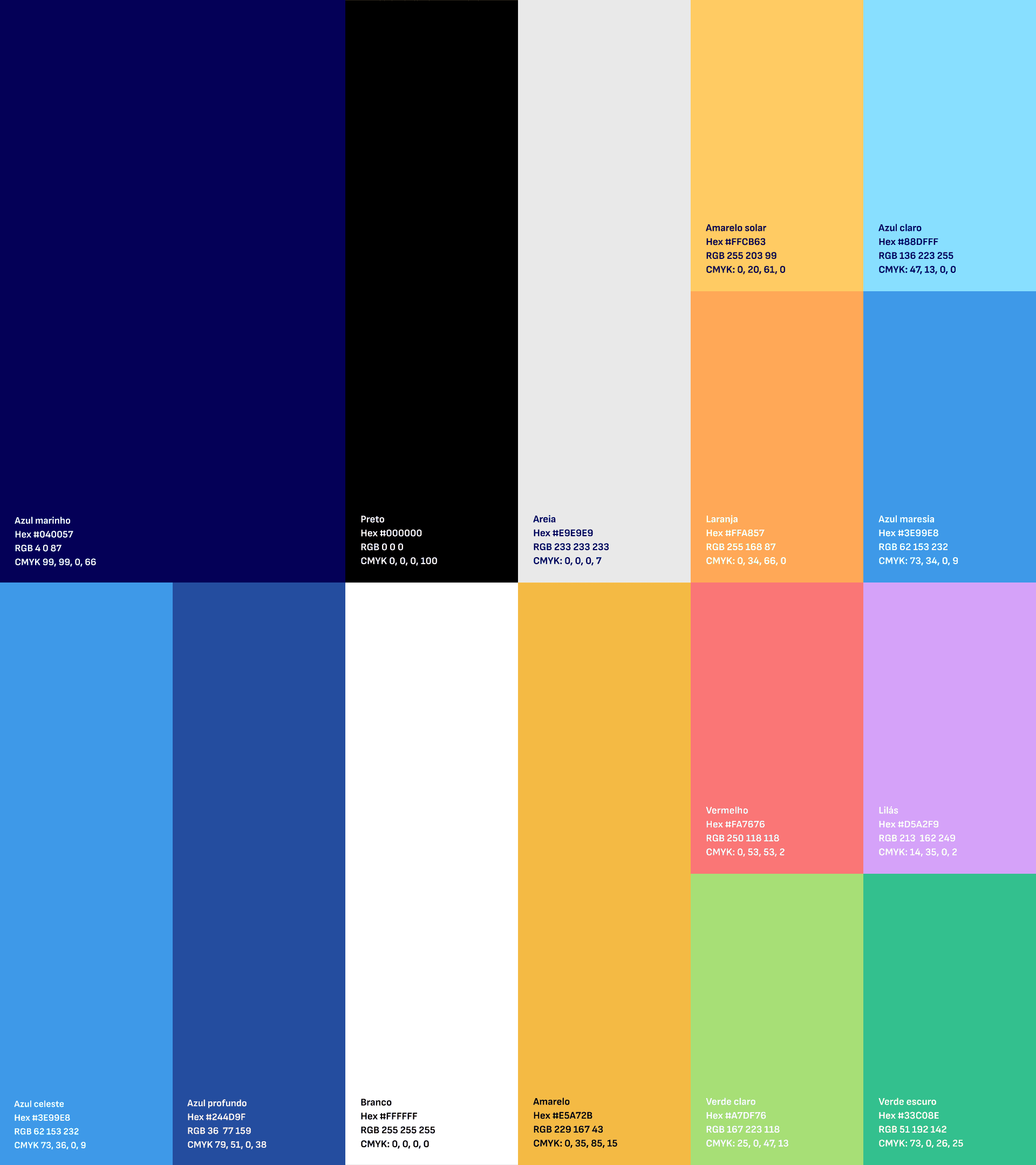
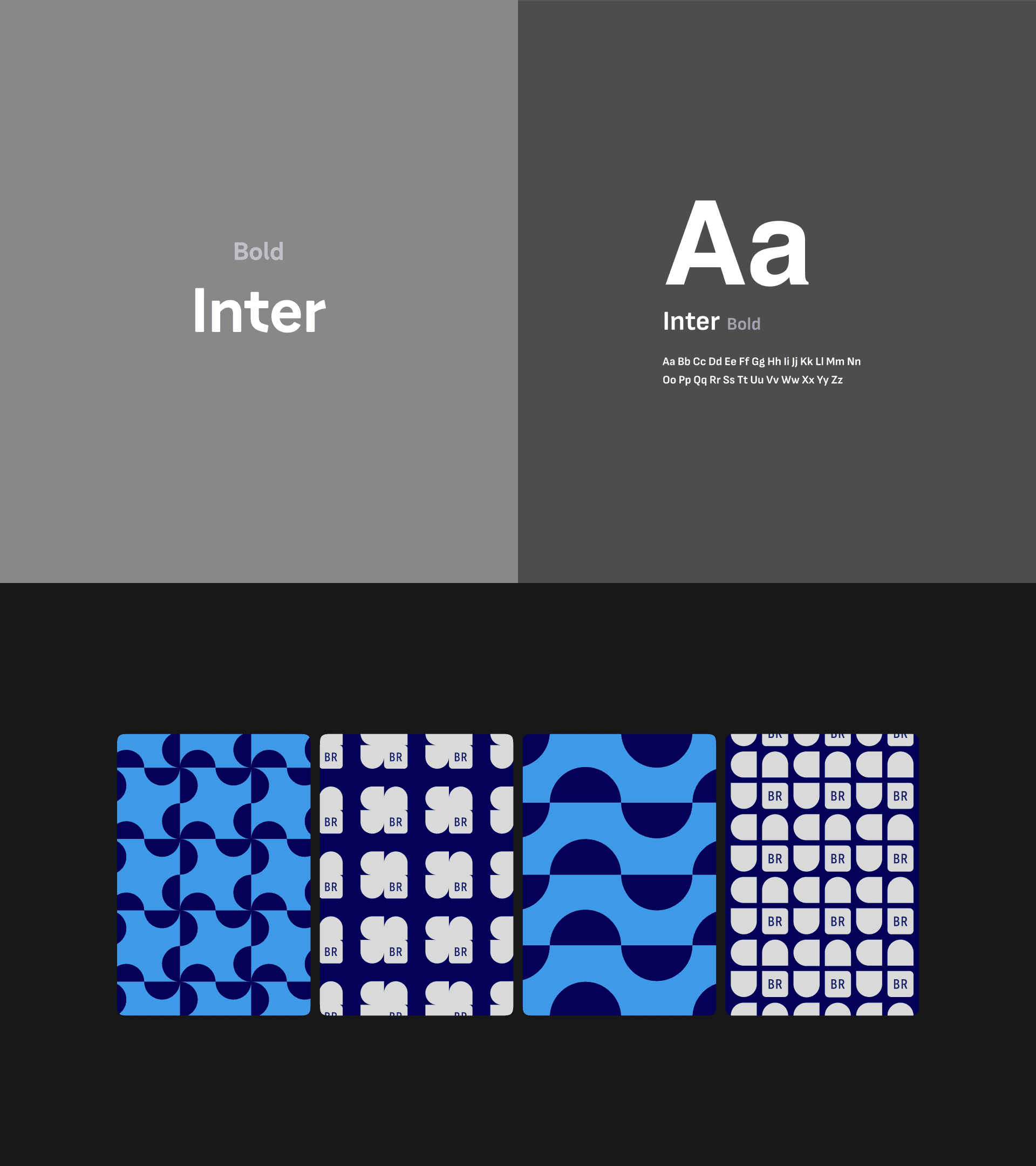
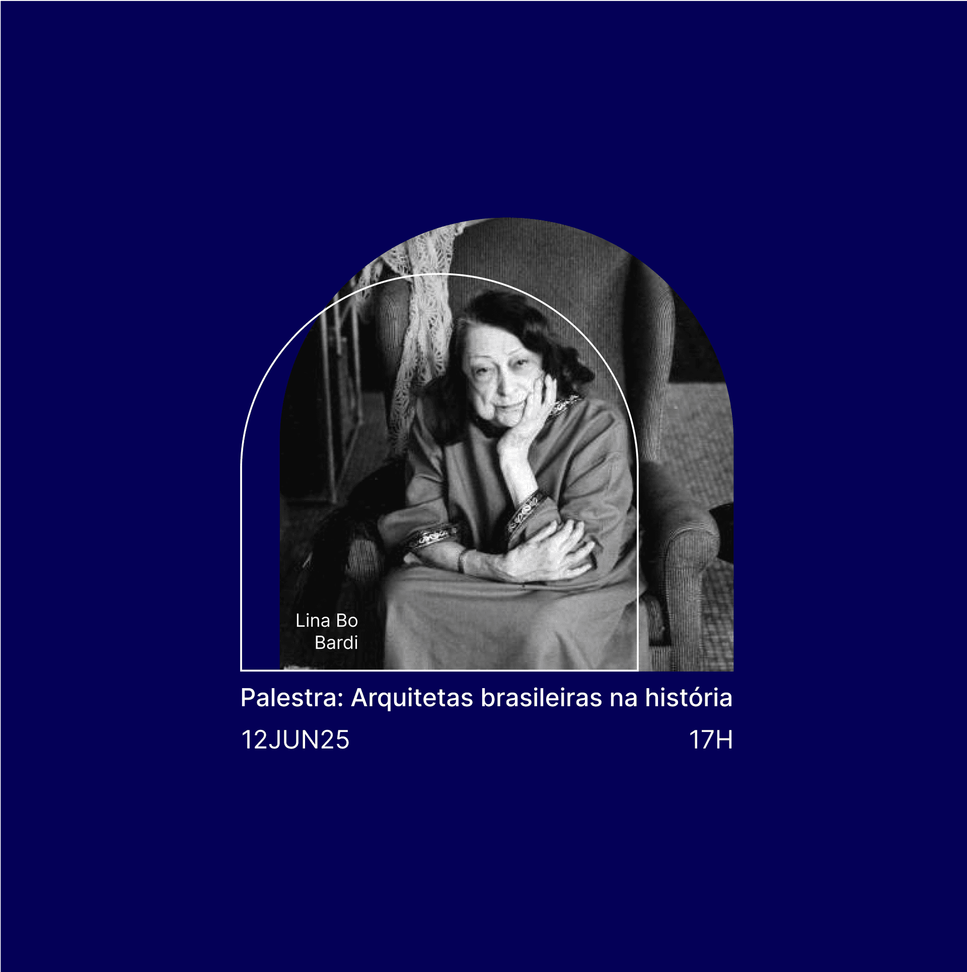
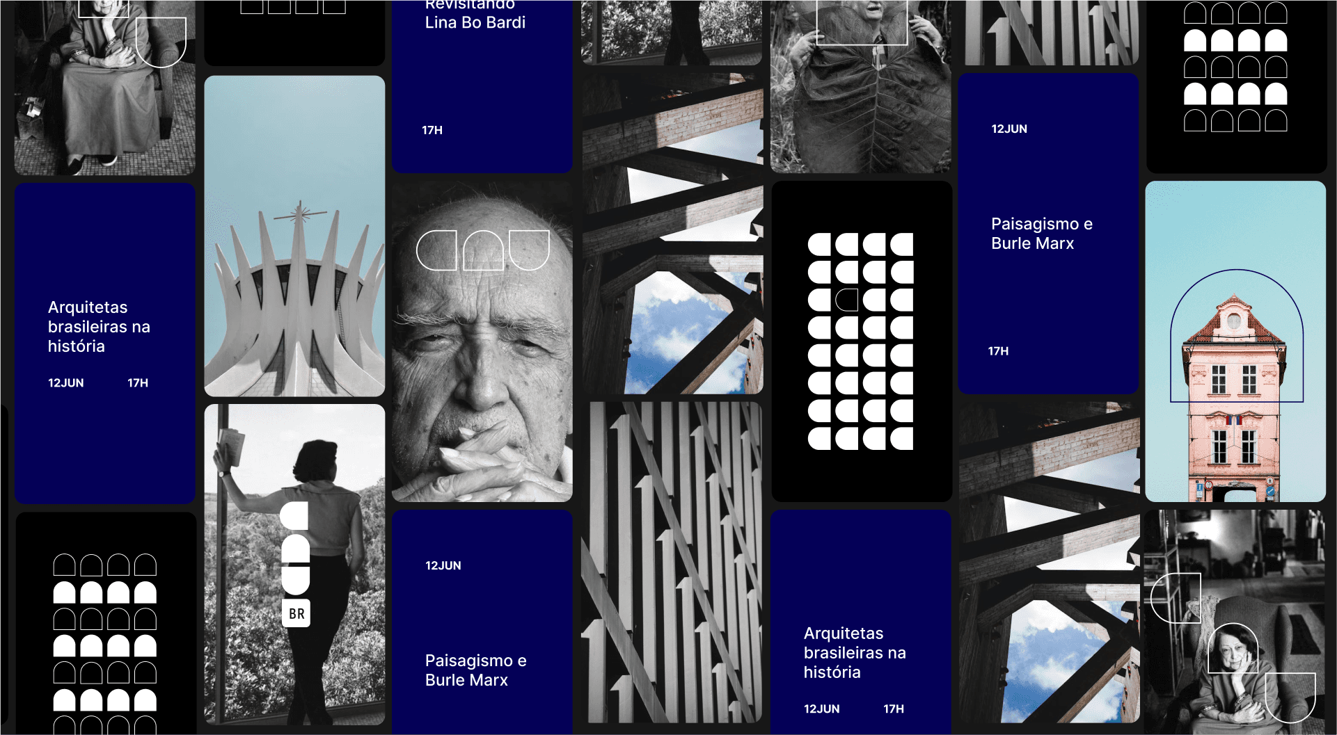
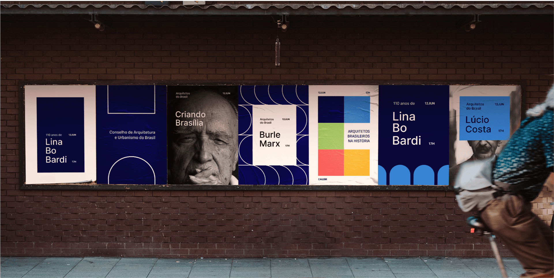
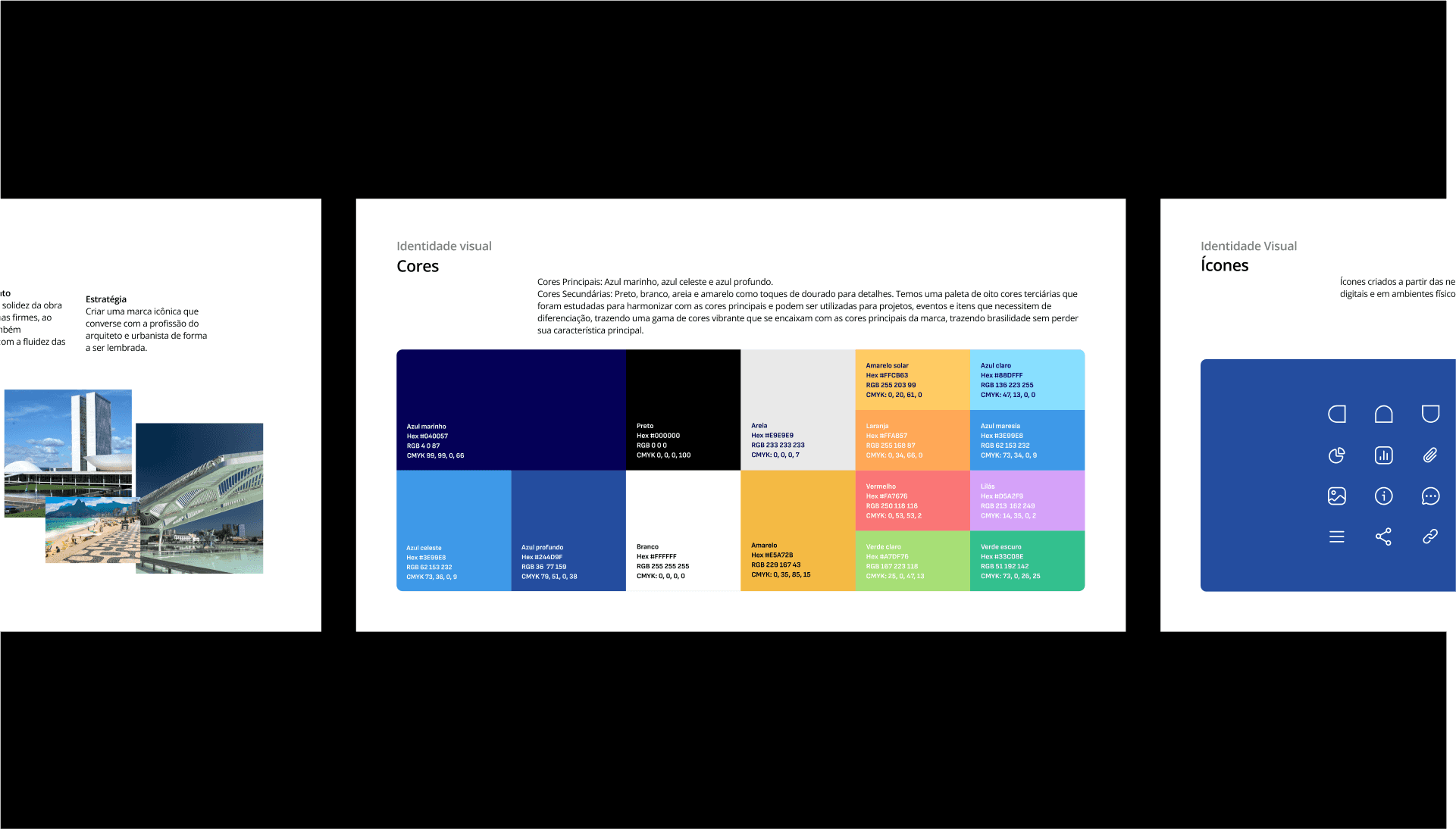
The proposal is rooted in the same foundation that governs architecture: the rigor of geometric forms and the creativity of their combinations. The visual identity was designed to be iconic and memorable, inspired by modular elements of Brazilian architecture, such as tiles and cobogós, to provide originality and a strong sense of belonging.
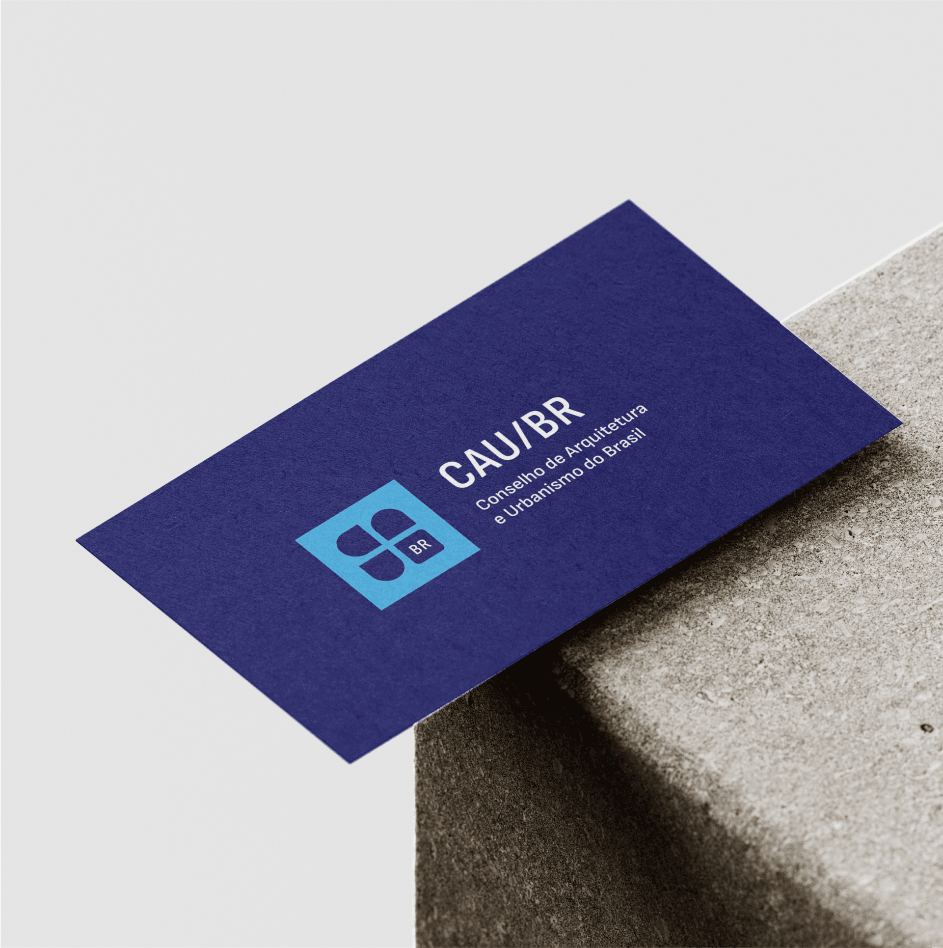
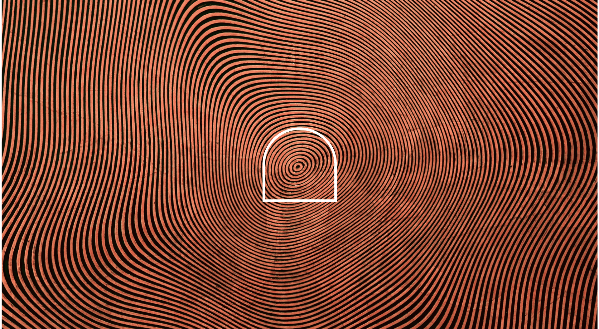
The CAU/BR logo balances the solidity essential to architecture with the fluidity of circles, resulting in a brand that is both robust and lightweight. Its key feature is its intelligent functionality: when rotated, the icon reveals the letters "C," "A," and "U," creating an identity that is, in its essence, architectural.
